Build applications that feel familiar from the first interaction.
People should not have to relearn how to navigate, fill out a form, or recover from an error every time they open another application. Clean, consistent interfaces let users carry what they already know from one task to the next. Predictable controls and clear feedback reduce hesitation and leave more attention for the work that matters.
That consistency should extend beyond appearance. A coherent experience adapts from mobile to desktop, remains legible in light and dark mode, accommodates different languages and right-to-left layouts, and supports keyboard and assistive-technology users. Responsive design, internationalization (i18n), and accessibility (a11y) belong in the foundation, not on a finishing checklist.
@mieweb/ui brings that approach to your browser interface through reusable
controls, navigation, forms, feedback, and data displays. Shared interaction
patterns provide familiarity; theme and brand tokens give you room to make the
application your own. Developed at MIE, the library is available for applications
in any domain under its license terms, not just MIE products.
The components are built with React, but your application does not have to be. Use them throughout a React application or embed them in selected areas of Bootstrap-based, server-rendered, or other non-React pages. Adopt a component or a workflow at a time without rewriting the rest of your interface.
Start with a common foundation and spend more time on what makes your application valuable. The components support inclusive design; they do not automatically translate your content or guarantee accessibility. Validate their composition, language, and behavior with the people and devices your application serves.
The library is @mieweb/ui. Storybook is its documentation and experimentation
environment, where you can explore those components without building an app
first. This introduction is shared by GitHub, npm, and Storybook.
- See it in action, no installation needed.
- Get started, with or without an AI coding agent.
- Explore and compose components.
- Contribute or run locally.
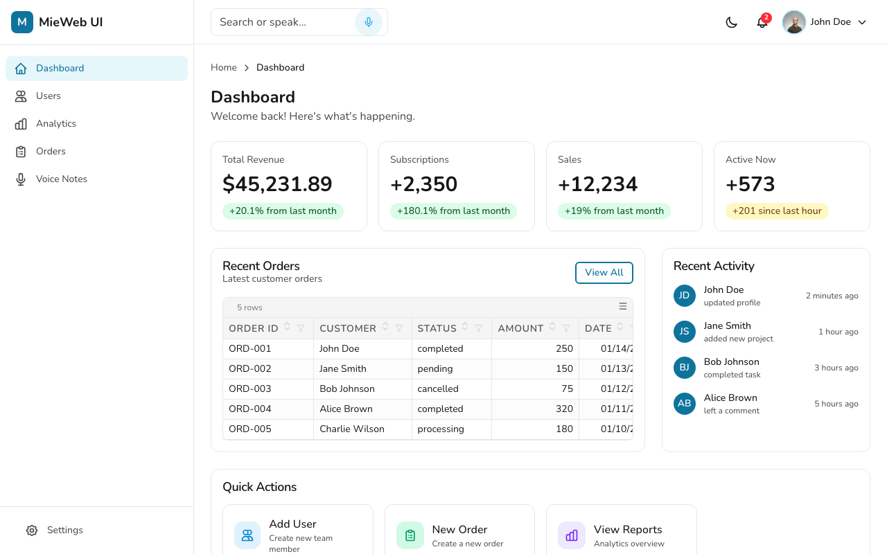
Open the interactive dashboard to see navigation, headers, cards, and data displays working together in an application layout. Try the brand and theme switchers to see how the same components adapt. No installation required.
The components require React 18+ and React DOM 18+ to render, including when embedded in a non-React page. If your project already has those dependencies:
npm install @mieweb/uiUse pnpm add @mieweb/ui or yarn add @mieweb/ui if that is your project's
package manager. You do not need to clone this repository or run Storybook to use
the library.
For a project without React, install the rendering dependencies:
npm install react react-domUsing an AI coding agent? Set up its instructions and read the component-selection and integration rules before asking it to add components to your application.
Mount components into a dedicated DOM element with React DOM's createRoot, leaving the rest of
the page under its existing framework's control. Unmount the React root when the
host removes that area. This requires a JavaScript build that supports React;
the components are not framework-free HTML widgets.
When embedding alongside Bootstrap or other stylesheets, check CSS resets, global selectors, and theme styles for conflicts. Mounting into a separate DOM element does not isolate CSS.
From your application's repository root, run:
npx @mieweb/ui init-agentThis installs component-selection, composition, theming, and accessibility rules
so your agent can start with existing library components. It writes
mieweb-ui.instructions.md in .github/instructions/ for VS Code Copilot and
updates a managed block in AGENTS.md for agents that read that file. Rerun after upgrading
@mieweb/ui to refresh the rules.
Read the agent setup guide and rules. These are instructions for coding agents, not an automatic PR reviewer or merge gate. Agent-assisted and manual development use the same library and setup below.
Import the precompiled stylesheet once in your application's entry point or root layout. Import a brand stylesheet after it when you want that brand's tokens:
import '@mieweb/ui/styles.css';
import '@mieweb/ui/brands/bluehive.css';
This CSS path does not require Tailwind in your application. For a first interactive example, render a theme switcher inside the provider:
import { Button, ThemeProvider, useThemeContext } from '@mieweb/ui';

function ThemeToggle() {
  const { resolvedTheme, setTheme } = useThemeContext();

  return (
    <Button
      aria-label="Dark mode"
      aria-pressed={resolvedTheme === 'dark'}
      onClick={() => setTheme(resolvedTheme === 'dark' ? 'light' : 'dark')}
    >
      Dark mode
    </Button>
  );
}

export default function App() {
  return (
    <ThemeProvider>
      <ThemeToggle />
    </ThemeProvider>
  );
}
In production, supply translated labels through your application's i18n system. In Next.js App Router, put this interactive example in a client component and import global styles from the root layout.
Already using Tailwind? Follow the
Tailwind 4 integration guide
for CSS-first configuration, @source, and theme tokens. Tailwind 3 consumers can
use @mieweb/ui/tailwind-preset. Do not apply a Tailwind 3 configuration as a
Tailwind 4 setup.
Heavy integrations use separate entry points and optional peer dependencies so you only install what you need:
- Data grids: DataVis NITRO, imported from
@mieweb/ui/datavis. - Form authoring and rendering: eSheet integration, imported from
@mieweb/ui/esheet. - Rich text and code editing: Kerebron editor setup, imported from
@mieweb/ui/kerebron.
Check the selected integration's dependencies before importing its entry point. AGGrid is deprecated for new work; start with DataVis NITRO for tabular data.
Open the component explorer. Storybook is the wrapper around the examples: its sidebar selects components, a story demonstrates a particular configuration, and Docs presents guidance and the API. Controls change example props; theme and brand tools let you inspect different appearances. Those tools belong to Storybook, not to the component you install.
Start with the user's task, then compare components before choosing an API:
- Browse and work with records: start with DataVis NITRO and compare Table. NITRO provides integrated data tooling; Table provides lower-level markup. Consider the behavior your application would need to supply and consult the selection rules before choosing an exception.
- Navigate a long document: compare TableOfContents and ReadingProgressBar. A TOC provides named destinations and navigation. A reading bar is a decorative document-scroll cue, not navigation or proof of reading. They can complement each other; neither may be needed for short content.
- Assemble an application view: explore the Dashboard example. Inspect how navigation, headers, and content fit together, then adapt the composition to your workflow rather than copying the layout indiscriminately.
For each choice, ask why it fits, when an alternative would be better, what state your application owns, and how it behaves alongside neighboring components. Exercise loading, empty, error, keyboard, and narrow-screen states in the actual application, not only the isolated story.
The catalog is still being improved: not every component has comparison or composition guidance yet. Do not treat an isolated example as evidence that no related component exists. Use the component policy and flag missing or conflicting guidance in a documentation issue.
- Branding: the brand system and visual tokens.
- Adoption guides: integration pitfalls and migration paths for existing applications.
- AI-assisted migration plan: an ordered approach to adopting the library.
- Meteor migration: framework-specific migration guidance.
To change the library, improve its guidance, or run your own Storybook, follow CONTRIBUTING.md. It covers repository setup, local development, tests, component conventions, and releases. Those steps are not required to consume the npm package.
Found unclear selection advice or an undocumented relationship? Documentation contributions are welcome alongside component fixes. Edit this introduction to improve the shared GitHub, npm, and Storybook content. Published copies update when the package is released or the documentation site is deployed.
Copyright © 2026 Medical Informatics Engineering, Inc. All rights reserved.
This software is source available:
- Free for open source projects: use, modify, and distribute in open source projects with attribution.
- Free for non-commercial use: personal projects, education, and research.
- Commercial license required: for proprietary products or commercial use, contact licensing@mieweb.com.
See the LICENSE for full terms.